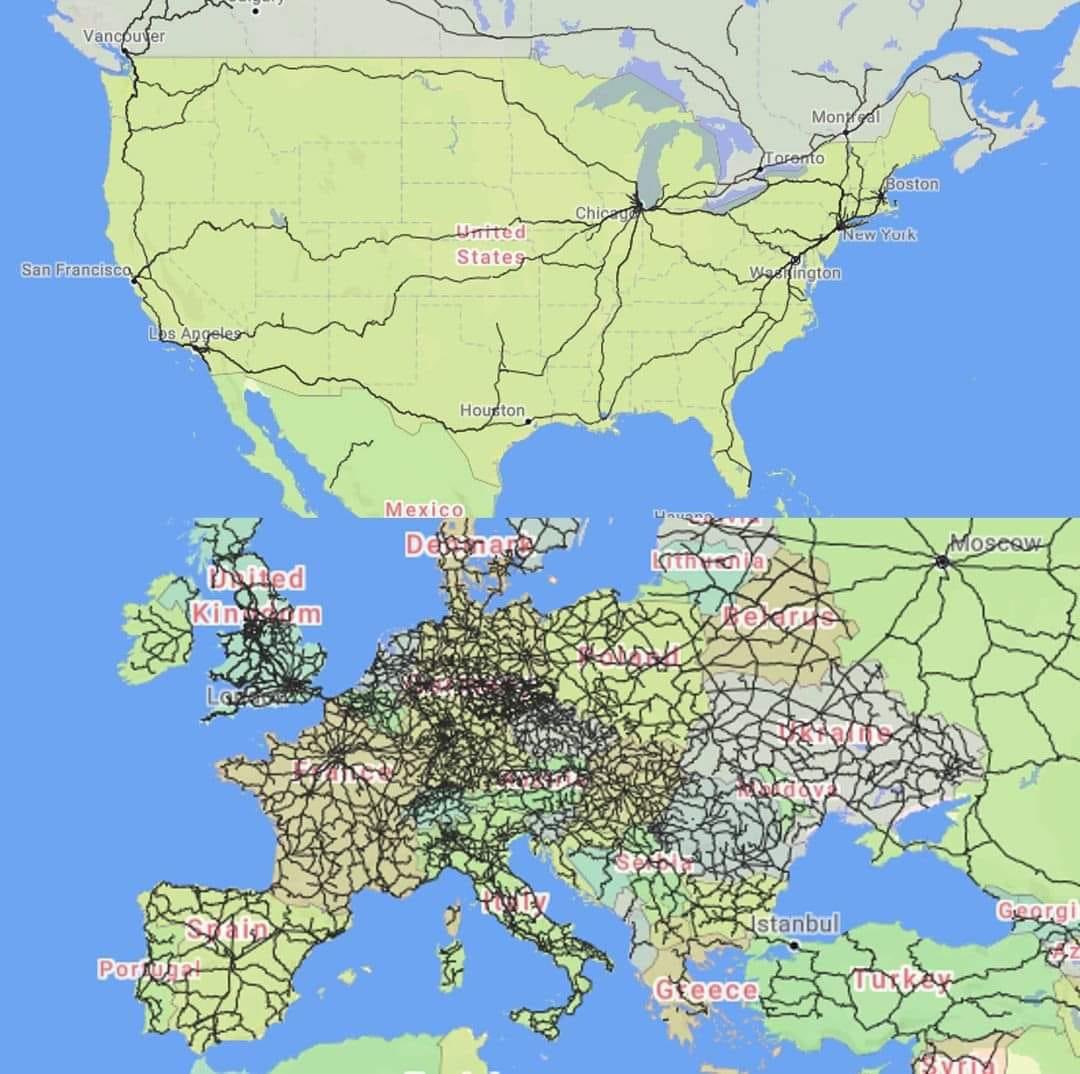
The Picard Maneuver@lemmy.world to Map Enthusiasts@sopuli.xyz · 2 years agoA map of passenger trains in the US vs Europelemmy.worldimagemessage-square13linkfedilinkarrow-up190arrow-down18
arrow-up182arrow-down1imageA map of passenger trains in the US vs Europelemmy.worldThe Picard Maneuver@lemmy.world to Map Enthusiasts@sopuli.xyz · 2 years agomessage-square13linkfedilink
minus-squaremercano@lemmy.worldlinkfedilinkarrow-up14arrow-down2·2 years agoThis population density map will probably help explain the difference.
minus-squareessell@lemmy.worldlinkfedilinkarrow-up11arrow-down2·2 years agoIt helps explain some of the difference. Not quite correlation.
minus-squareElderWendigo@sh.itjust.workslinkfedilinkEnglisharrow-up1·2 years agoSo many maps in pop culture trying to make a statements are really just population density maps.

This population density map will probably help explain the difference.
It helps explain some of the difference. Not quite correlation.
So many maps in pop culture trying to make a statements are really just population density maps.