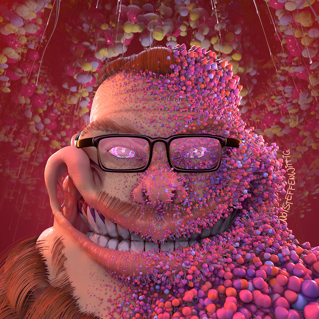
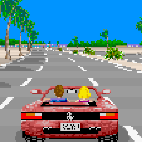
I remember playing Doom for the first time and I remember thinking that graphics would never get any better than that. Like the arm even moves when he walks!
How horribly naïve I was.
@lobut I thought Donkey Kong Country on the SNES was photorealistic and rivaled movies like Terminator 2, which used the same technology behind the scenes. I thought every game would look the same as Donkey Kong Country in future.
I remember getting deep into that game, trying to make my own levels with megs of RAM and having things crash. Changing all the sprites on some of the mobs, recording my own sounds and replacing various noises in the game. I learned how to strafe using 100& keyboard (couldn’t look up or down in that game), and dominating the evil. Good time to be a teenager. I still think some of the secret rooms in that game were some of the best.
I remember feeling the same way with Myst. “It even has video!”
I had those moments multiple times. I remember thinking the same about International Karate on the Amiga. Then my mind was blown with Street Fighter II, Max Payne was one for sure as mentioned elsewhere and let’s not forget Carmageddon, which got a little bit too realistic. Graphics technology developed so fast, you can’t compare it to today’s upgrades. As I’m older now 10 year old games still feel “new” to me.
As I’m older now 10 year old games still feel “new” to me.
It’s not just you getting older, it’s also diminishing returns.
It takes more and more effort, both in manpower as in graphical processing power, to make graphical leaps, and the visible returns are getting less.
You can compare it to video formats:
- VHS => DVD: huge quality upgrade
- DVD => 1080p HD: yeah that definitely looks better
- 1080p => 4k: I guess it’s a little sharper?
- 4k => 8k: Well it’s … more. Also: why is everything running so hot?
I actually liked 3D movies and I even bought the Nvidia 3D kit to play my PC games in 3D, it was amazing (to me)!
But it was an imperfect 3D technology that gave many people headaches, so I can understand why it eventually got scrapped.
I do have a VR headset too, but besides Half-Life Alyx, there haven’t really been any VR games I am so hyped for that I keep going back to play in VR.
Agreed. I used to be blown away by a game from a technical standpoint 2-3 times per console generation and at a similar clip on the PC side. Now we are getting GTA V and Skyrim re-released for the 10th time. Neither of those games were groundbreaking at the time (IMO) as they both were good but predictable progressions from their previous entries.
Playing DKC and seeing the detailed sprites, Mario 64 (and several others) ushering in 3D, the FMVs in FF VII, and the enemy AI in FEAR, these things felt like monumental leaps forward. Nowadays, the closest thing I can think of is something like Elden Ring or TotK which to me is just taking an existing good game (Dark Souls/BotW) and slapping a mechanic onto it (Open world/crafting). They are both excellent games, but neither compare to the leap forward of FF VII or Mario 64.
Maybe I’m just jaded by adulthood and have my rose tinted glasses on.
grew up with c64, spectrum+3, master system, genesis, nes, snes. So when I bought a ps1 with my paper round money and started up the intro to Soul Blade, that would become Soul Calibur, the graphics jump shook me to my core and brought tears to my eyes. I was like "THIS is the peak of graphics. Nothing can beat this.
Here’s the video: https://www.youtube.com/watch?v=5Jscuco8zEk
I mean that looks legit. I’ve got no nostalgia at play here, having never seen that intro before.
My peak game i think it was F.E.A.R., my pc couldn’t run it at full but I remember thinking it couldn’t possibly get any better than that
In some ways it didn’t.
No microtransaccions, no battle pass, just a nice story to tell through a videogame, awesome soundtrack also
Always so kick ass
Always?
Have you seen the cover art for the first MegaMan game? lmao
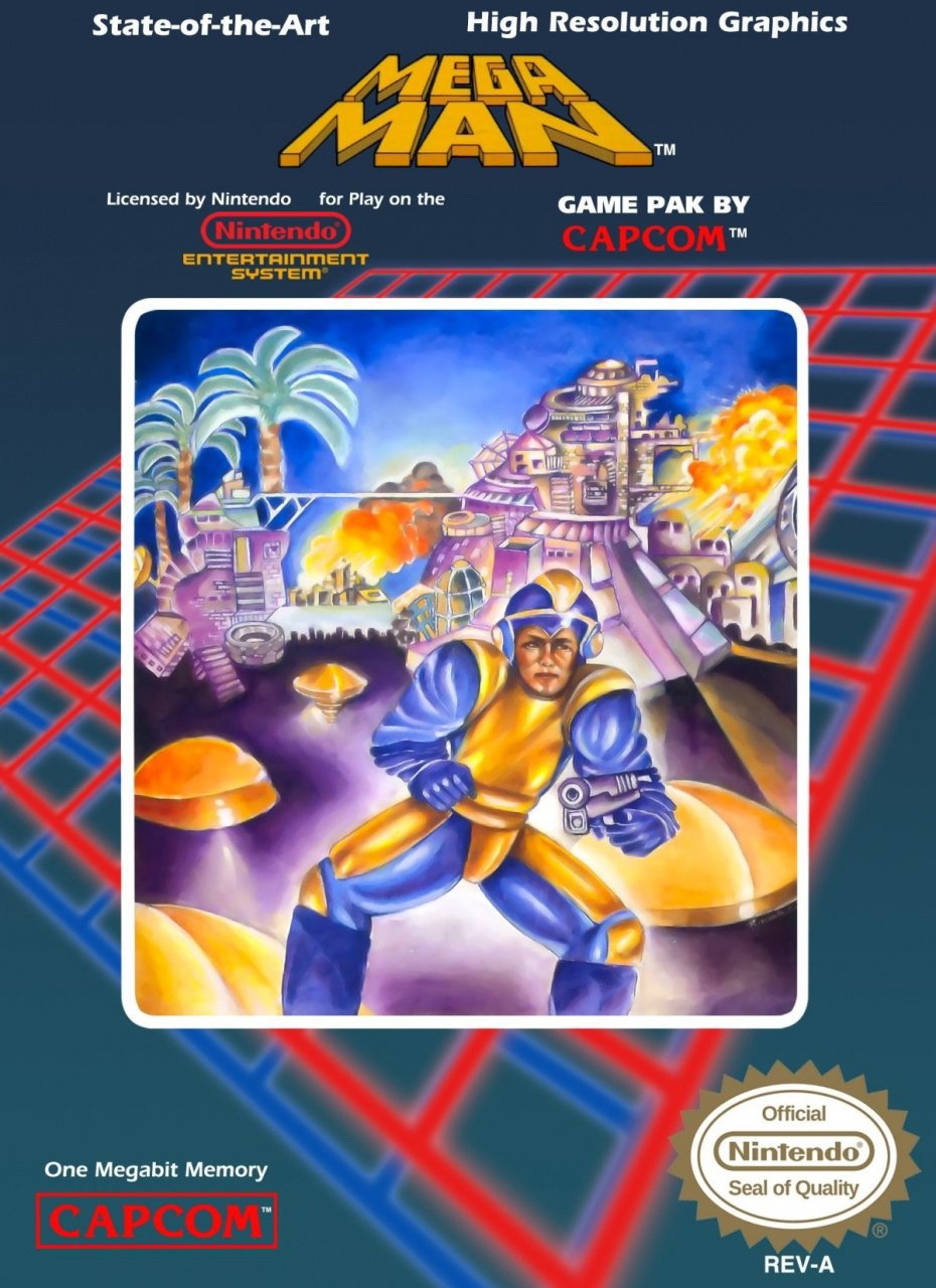
Even funnier with the boasting of “state of the art high resolution graphics” at the top. Though to be fair, the actual game looks infinitely better than that cover.
On the other hand, the European box art is fucking awesome
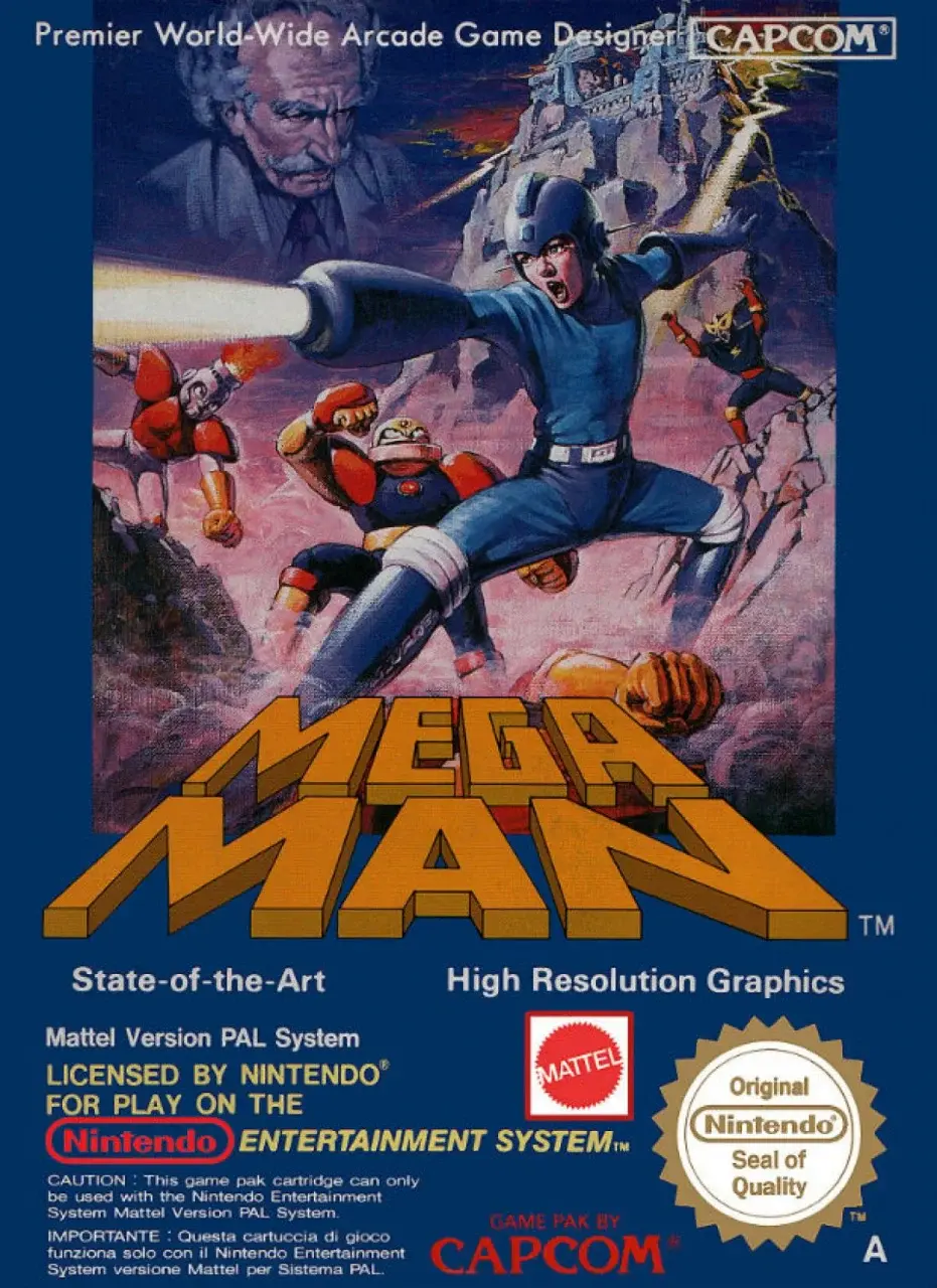
Other than Dr. Wiley lookin’ like fuckin’ Mark Twain, that is pretty sick. Actually, fighting Mark Twain would be sick, too.
Looking at this cover art again now, it kinda reminds me of AI-generated art lol
I love bashing AI art but in AI art it’s usually the details that you spot at second glance that makes it fall apart. The Mega Man cover is just fundamentally messed up to a degree where even AI art is miles ahead.
Yeah true, AI art is more “looks OK at first glance, but smaller details are messed up”, while this one is the opposite of that so “smaller details are actually fine, but as a whole it looks quite messed up” haha
I don’t know which I love better
- This isn’t even the right color scheme for the character, so it’s not like they misinterpreted the sprite
- Rock over here looks like he shit himself upon seeing a Mettaur and is trying (and failing) to pretend he didn’t.
- Mega Man doesn’t even use a gun, he uses a Buster. The only time Mega Man has used a gun are instances that parody this boxart or rare occasions like when his internet incarnation uses the Gun Del Sol during crossover events with Boktai
Even funnier with the boasting of “state of the art high resolution graphics” at the top.
At the time, this want really that inaccurate. There weren’t many video games with the same quality.
The only reason it’s laughable now is because it’s been 35 years since the claim was made.
No, it was inaccurate, even at the time. The Famicom was built to cost and and mainly used cheap off-the-shelf components that were already obsolete when the system first released in 1983. The NES released in North America the same year as the Commodore Amiga, a system that actually was cutting edge, and represented a big leap forward in what home computers could do graphically. By the time Mega Man released, the Amiga was on it’s second revision and other home computers were rapidly catching up to it’s capabilities.
While Mega Man was one of the best games on the NES, it ran at the same resolution as every other game on the system, and was stuck working within the same limited color palette and low sprite limit that were more than five years behind the curve when it released.


I present Rigby, named after the finest dumbest fucking raccoon ever.
Always loved that they play a Master System.
Not sure, aye. Cartridge slot is on the other side and it’s connected to the TV via RCA with stereo audio. hmm, I can’t think of another console that meets those prerequisites though.
https://images.app.goo.gl/azt6TRq9PVan1tLf6
https://images.app.goo.gl/RZoAy5FSrVDuuGwz6
Mirrored I guess but is it.
VHS covers were the same way.
Also, it’s a terrible movie that was on Mystery Science Theater 3000.
No way would that kid be frowning. If this was legitimately in the late 70s or early 80s that kid would be ecstatic with the graphics.
There, I fixed it!
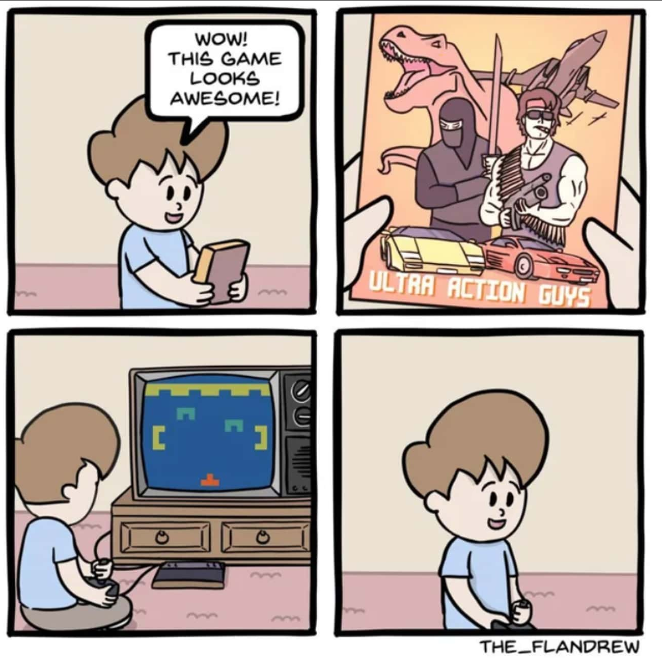
perfect
Except in the case of the Sega Master System, where the simplistic 8-bit graphics felt like a massive leap up from the terrible box art!

probably the nostalgia talking, but it was satisfying having all your games look the same on the shelf


