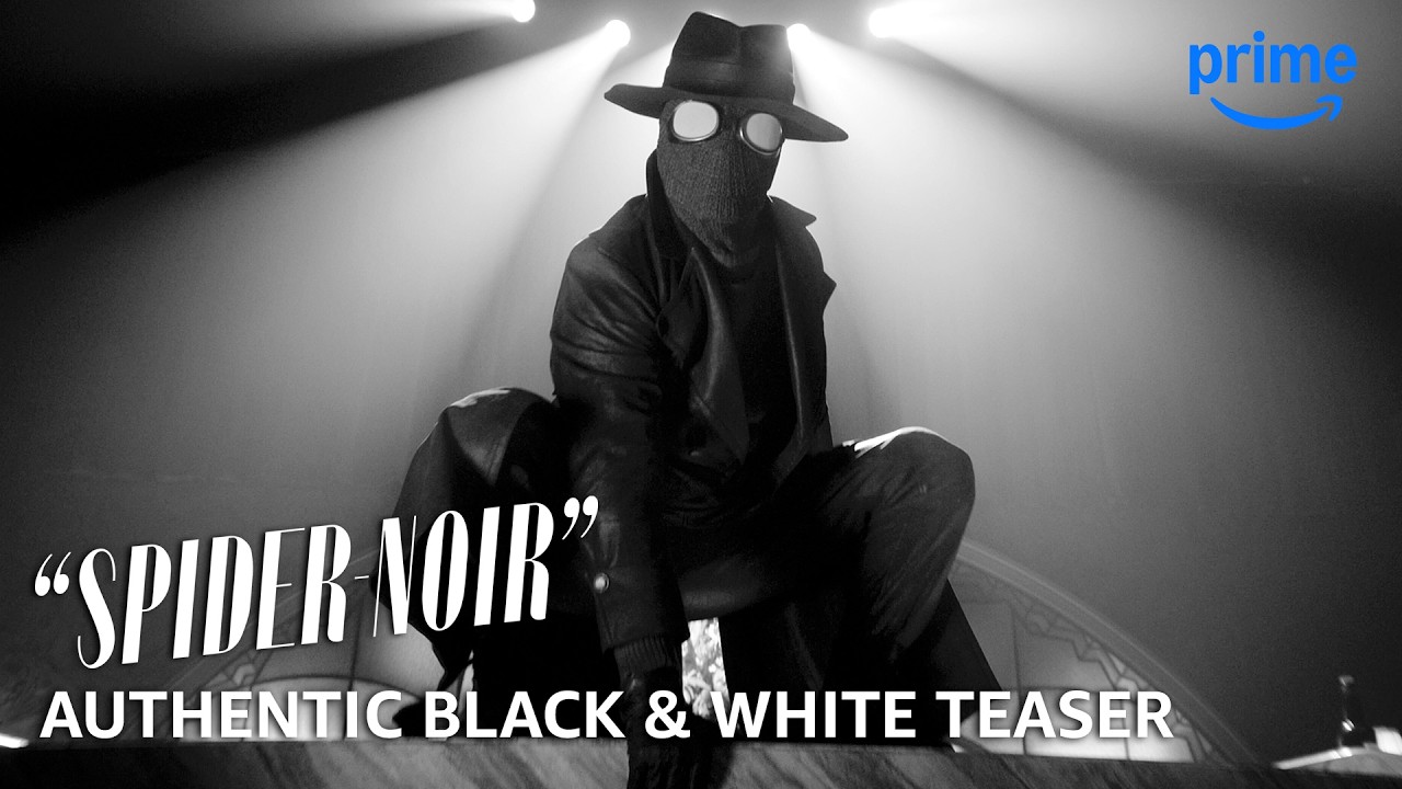
With no power comes no responsibility. "Spider-Noir" - a live-action series starring Nicolas Cage - arrives in Authentic Black & White and True-Hue Full Colo...
I thought the colour version looks almost like they were going for that 70s/80s look with the high contrast and high saturation, but it doesn’t quite get there.

I thought the colour version looks almost like they were going for that 70s/80s look with the high contrast and high saturation, but it doesn’t quite get there.
It’s most likely because they shot for the black&white/greyscale aesthetic, for which you need high contrast and high saturation to make it work.