For what i heard, a lot of people on the Linux community use Krita for image manipulation, even though, it’s intended for digital painting, and GIMP is the one intended for image manipulation, because people don’t like the GIMP’s UI.
My issue is, i never understood why they don’t like the GIMP’s UI, since i never have issues with it,(Although it’s probably because i’m used to the UI) so i need to adress this problem and ask you What does the GIMP UI has that you don’t like or hate so much and why you like Krita’s UI over GIMP’s?
Before you event comment your answer i need to ask you to do the following:
-
Address each specific issue along with an concise and direct explanation of why you don’t like it
-
Answers such as “I just don’t like it”, “I don’t like where it’s placed” or anything alike doesn’t count as “Concise and Direct”, we are adults, not 4 year old children.
-
If you can provide a suggestion of how GIMP’s UI can be improved, it would help a lot, and maybe this issue can be solved.
-
If someone else commented something you were about to comment, upvote them, this way we can address the most common issues effectively.
-
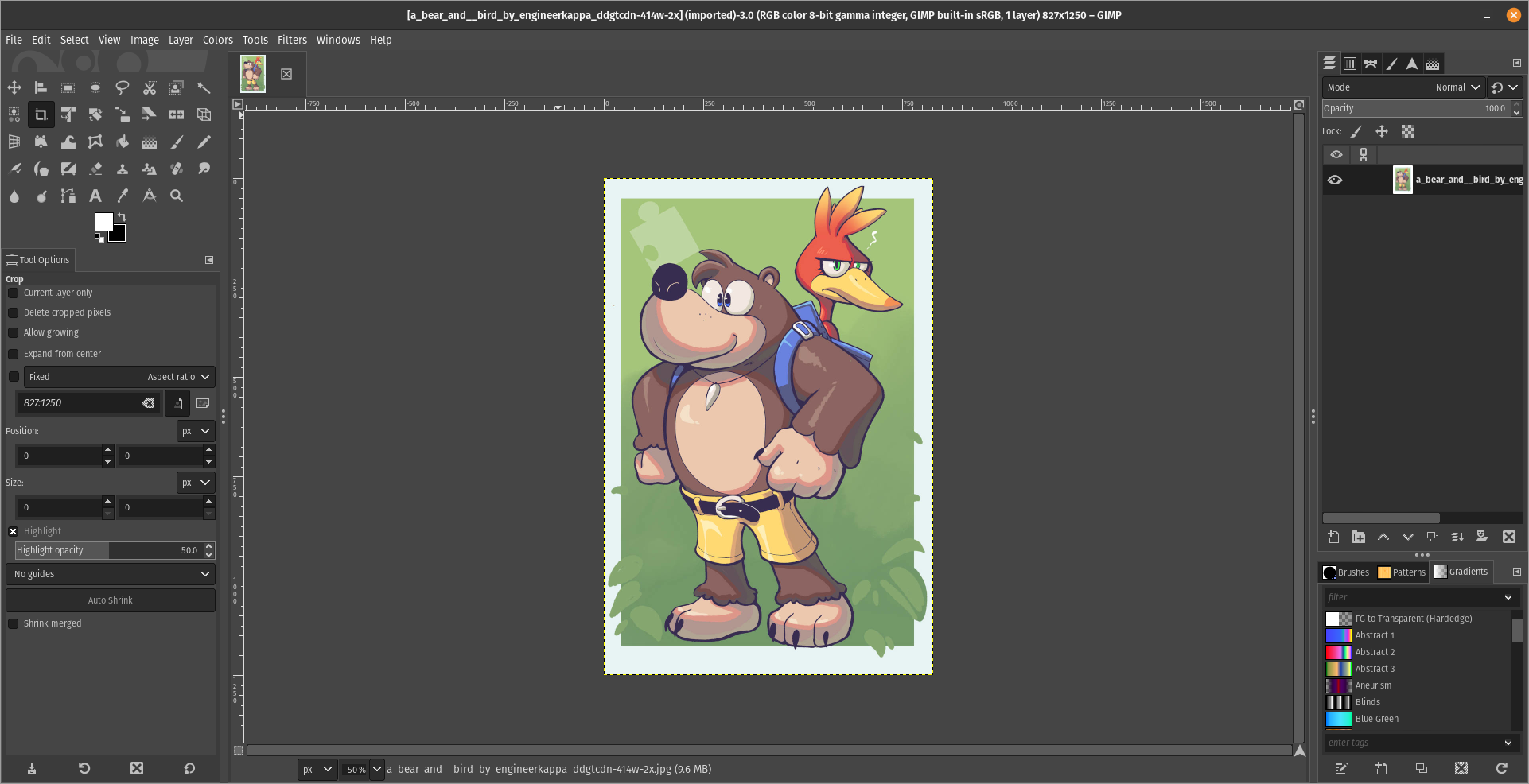
I need you to watch the screenshots of both UI’s, because something that most people don’t know, it’s how similar Krita and GIMP’s UIs are.
Krita’s UI

GIMP’s UI

(Credits to a friend of mine for lettig me use the screenshots.)
My ideas on how GIMP can improve it’s UI
-
Adding the option of the new UI selected by default, but with the possibility to switch to the new UI.
-
Possibly addding “work spaces” like Krita would help too, along with the possibility of exporting and importing them, this way people can have custom arrangements of the UI according to the kind of work they will do.
Thanks for reading and hopefully we can address this issue effectively.


I understand it’s not a clone, but the truth is ps has a much better ux. There is no reason to not to copy the better ux.
I tried this plugin, it does very little to make the experience better, it actually makes it worse because it’s more difficult to find things, when you can’t easily Google to find them.
Yes, but with Photoshop (If you are paying the creative cloud) You’ll be paying 60$ a mlnth which translates to 720$ a year every year for the rest of your natural born creative life.
Also, what functions are you trying to find anyway?
I’m paying 36 per month for the whole creative cloud. Whole. Photoshop, illustrator, AE,… It’s been a few months, but all of them are just better. Unfortunately it is what it is. And now, now with ai, it’s the only option reasonable.
So you’re letting yourself be a slave of the company and food for the bloodsuckers?
Edit: Not to mention that the software LITERALLY it’s not yours, you’re just paying a license that isn’t perpetual, so they can revoke it from you to make you stop using it if they want to.
I pay monthly fees for lots of stuff. A newspaper, Internet, water and heating,… For sure I’d rather not, but I mostly I don’t have an alternative option. With Adobe the case is such.
there ARE alternatives to Adobe Suite, here’s an article that talks about it https://notes.ghed.in/posts/2022/free-software-design-studios/
But in short:
Lightroom > Darktable Premier Pro > Kdenlive Ilustrator > Inkscape Adobe Audio Studio(I forgot the name) > Tenacity(Fork of Audacity)
You may also take a look at alternativeto.net to find more alternatives to more stuff
:)
Tried them all. They don’t compare.
There are some that can be replaced easily, like Adobe premier, maybe even after effects. Audacity for sure. Not indesign, Not illustrator, not photoshop. Not only because the alternative are worse, but because everyone else uses Adobe and its incredibly easier to collaborate. If you are a pro in graphic design, like a real pro that these tools are a daily use, you can’t use anything else but Adobe.
Can’t really compare Commercial Software with FOSS since both have different objectives, Adobe wants to empty your wallet and credit card along with everyone else’s, and FOSS focus on bringing great functioning alternatives
I’m sure you can get even more poetic about it without trying too hard, but at the end of the day you still end up with a tool that does the job significantly better and faster than the alternative - a tool that brings more value even though it costs more money.